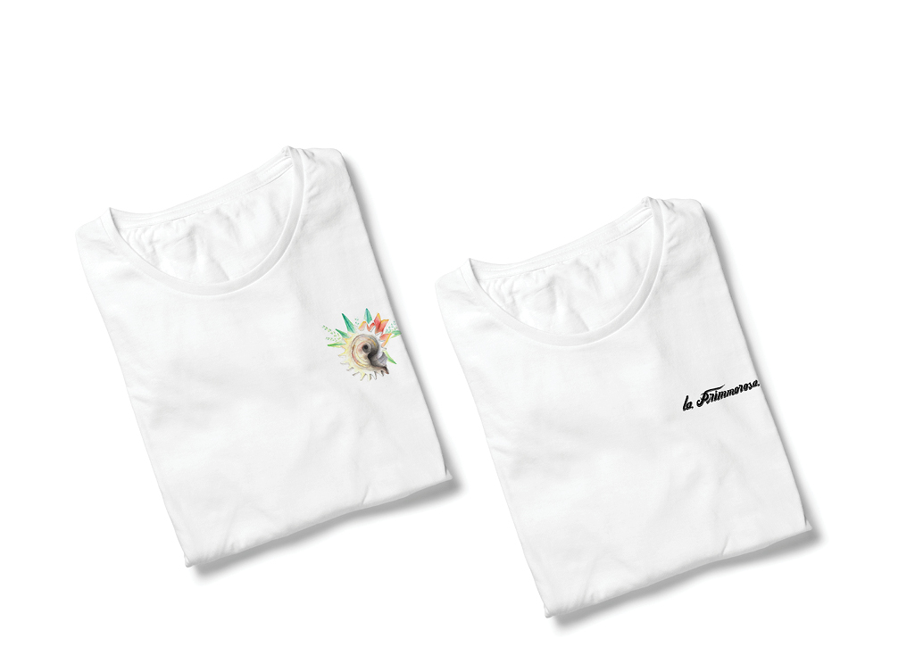
La Primmorosa, illustration & Graphic Design
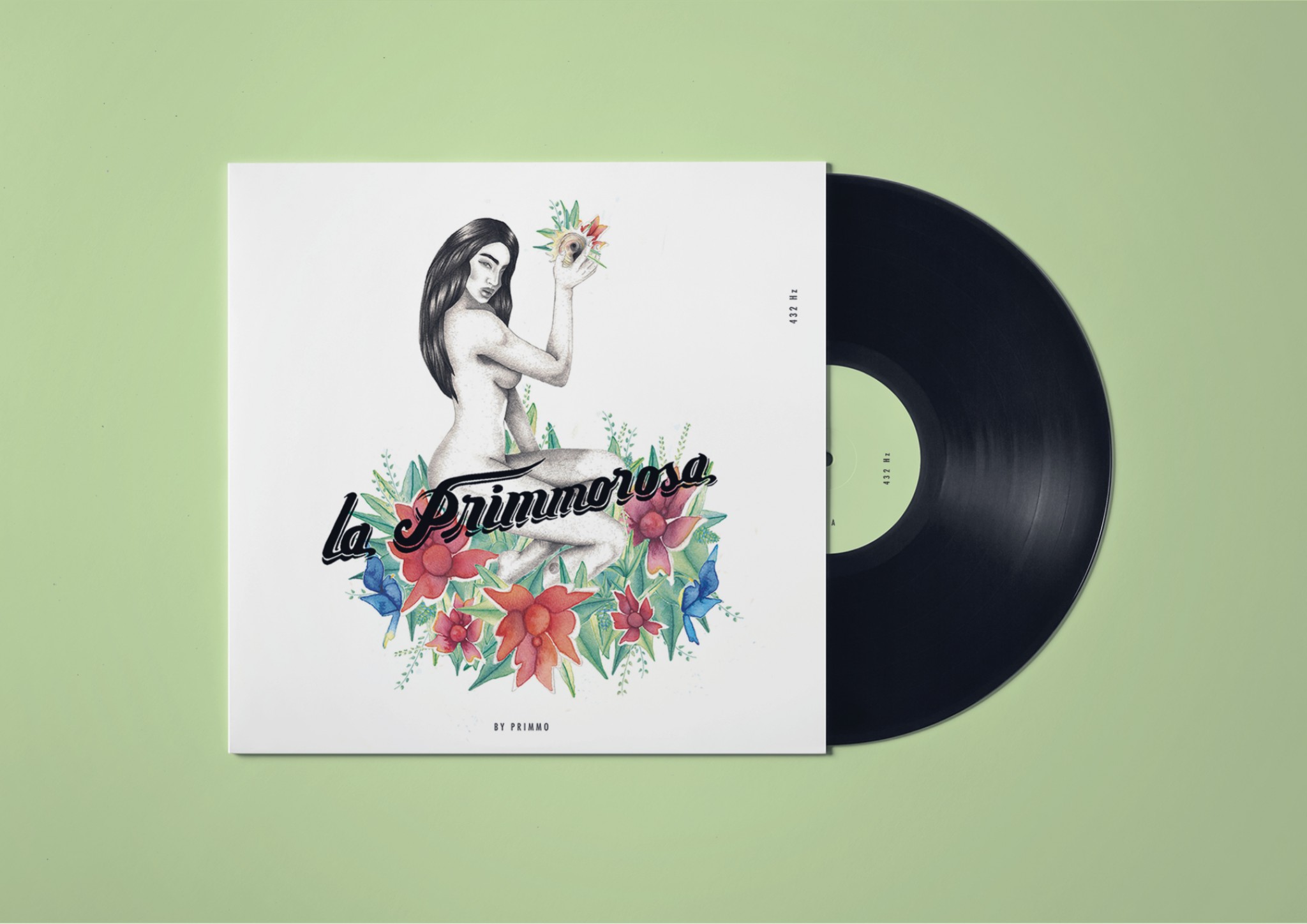
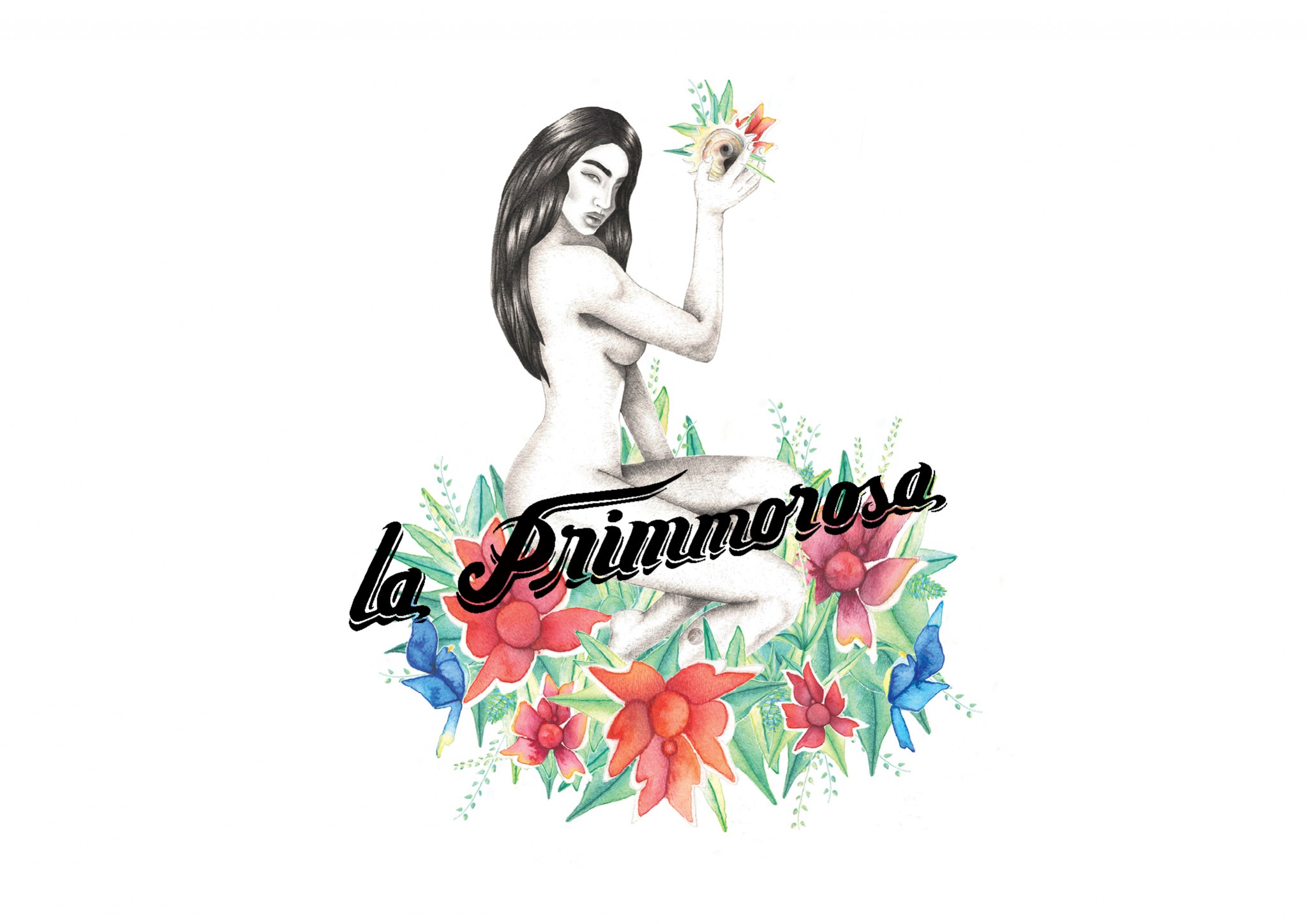
The purpose of the project was to create the album cover & identity for Primmo's, new album. The inspiration came out of the albums name "La Primmorosa" — We wanted to express & visualize the first love fantasy from a public bus driver of Guatemala City.
The Symbolism
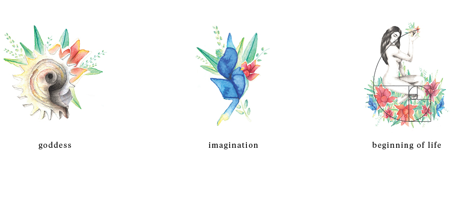
So a big part of the process & concept is the symbolism behind it: Primmo is a funk, latin & rock band, for this reason La Primmorosa is surrounded by a mix of tropical life, for which the color selection has various meanings like, imagination & passion. Now the reason for the sea shell she's holding is to symbolise music, but also to reflect she's a goddess — see, for the Pre-Colombians sea shells were the music instruments of the gods. And last but not least, the composition of all the elements together conform a Fibonacci — symbol of the begging of life, which fitted quiet perfectly also to express fertility.
The Service
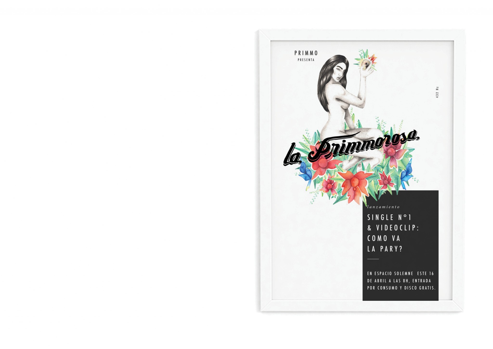
Illustration, graphic & lettering design for the album cover. Following several communication and graphic pieces where created from the visual identity. Such as tee shirts, posters, social media pieces among others.
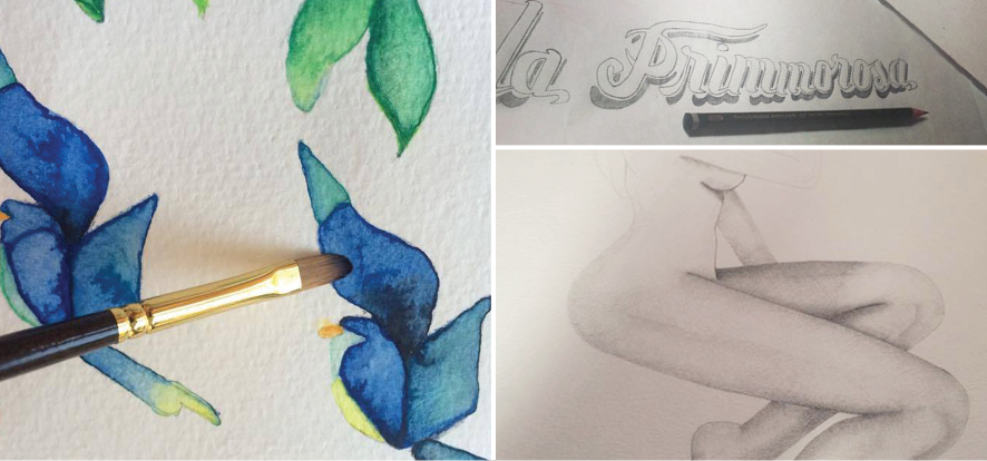
The technique is Pencil & Water color over cotton paper composed in a digital collage.